The Function of Color:
Rethinking How Functions Are Introduced
Most treatments of functions present the same representations with the same visual logic, or none at all. Each editorial piece in the examples below features alternative representations that do more instructional work.
The Problem
Standard introductions to functions present multiple representations: machine, map, arrow notation, however these diagrams are often undifferentiated.
These representations exist as illustration. The goal here is to make them function as instruction too, where every visual decision carries meaning and reduces the load on the reader.
Accesible design choices especially matter to learners with processing differences. When color, layout, and notation are used consistently and intentionally, the visual structure of the page does part of the cognitive work. This benefit generalizes: what reduces friction for a student with ADHD tends to improve clarity for every student.
Design Principles
- Use color consistently and intentionally. Blue for input and domain. Green for output and range. Apply this across correspoinding prose, diagrams, and notation.
- Every representation should earn its place. If different views of the same concept are presented, each one should add something the others don't.
- Reduce cognitive load at first contact. Titles, labels, and captions should orient the reader before asking them to process content.
Example 1 of 3
Visual Representation: The Machine Diagram
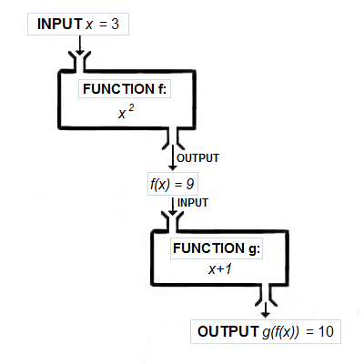
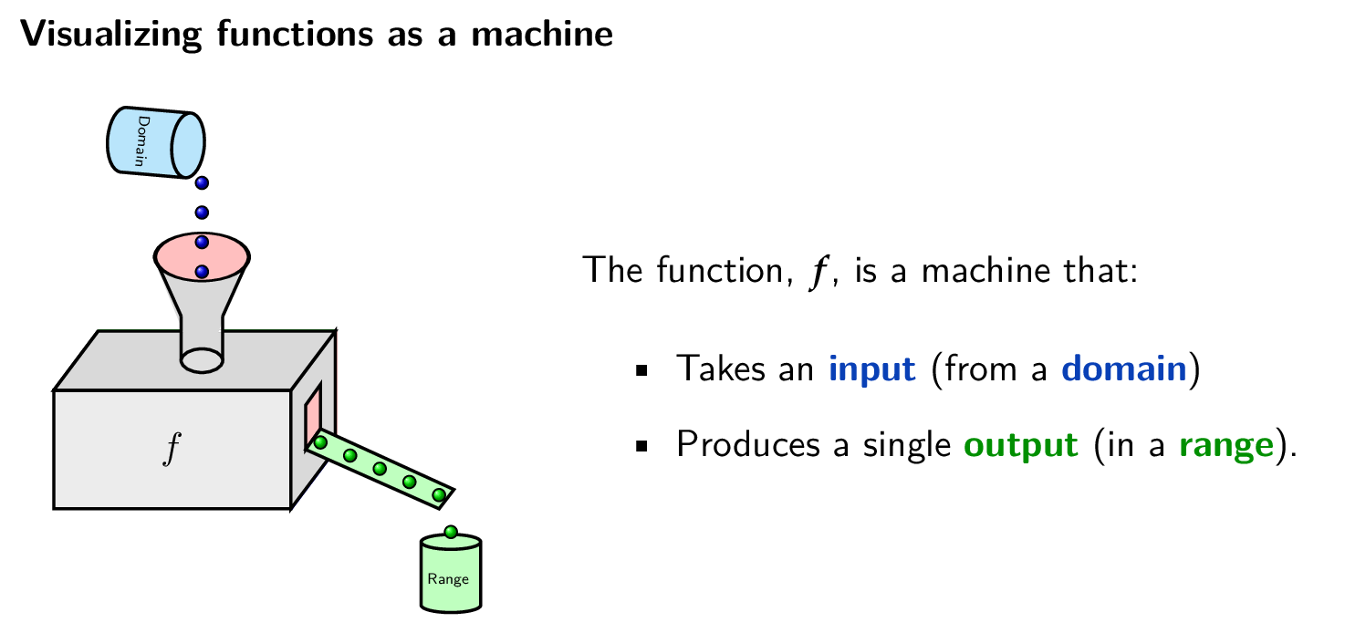
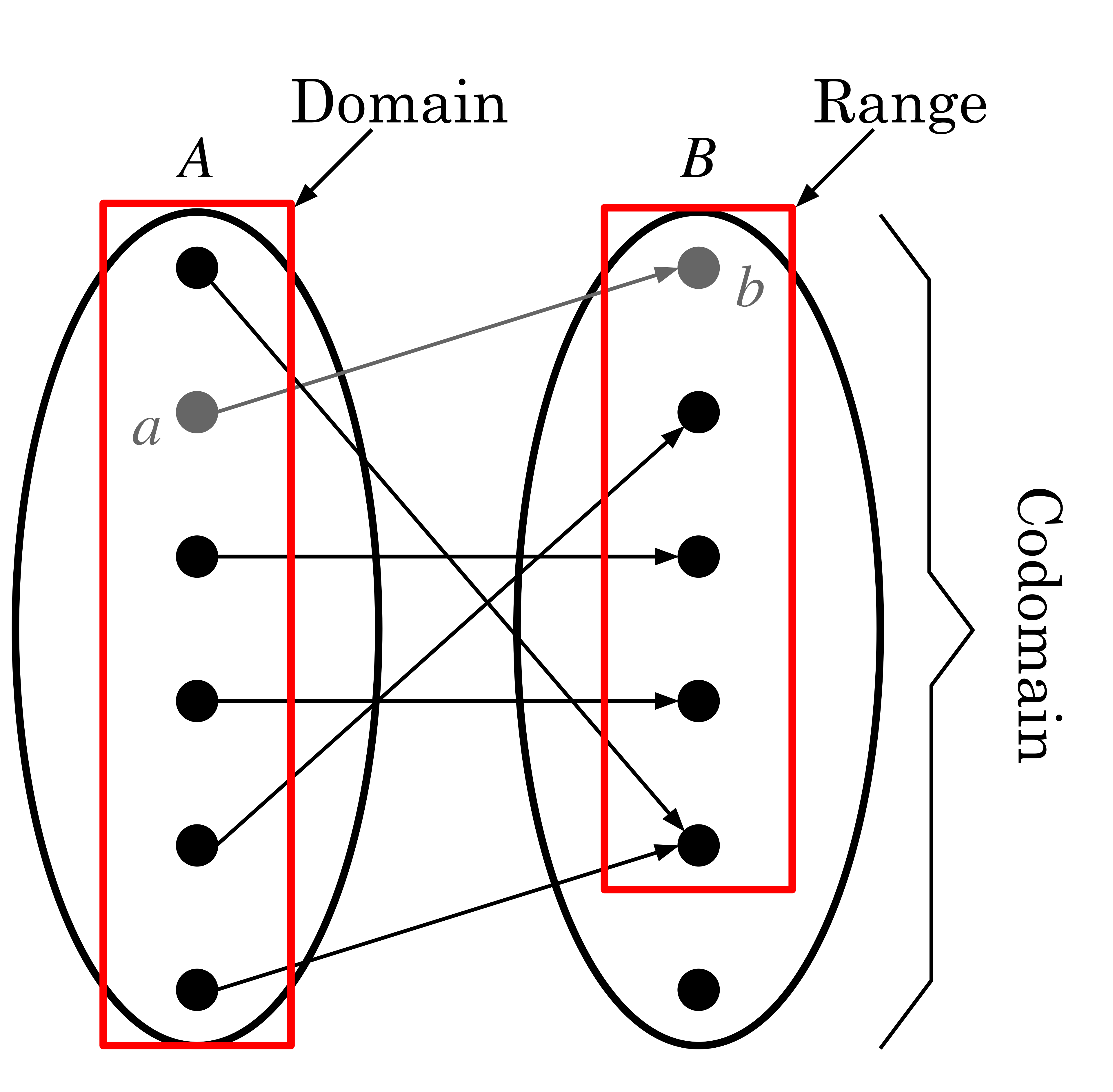
The Wikimedia diagram shown below is a standard textbook instructional treatment of a function that features a machine labeled as a function, f, alongside a labeled input and output.
The revised diagram illustrates this machine representation and applies consistent color encoding: blue for domain and input, green for range and output. Each input is a blue ball dropping into the machine; each output is a green ball rolling out. This visual tells the same story as the Wikimedia diagram but also adds information about the domain and range, creating a stronger visual cue system.

Example 2 of 3
Visual Representation: The Map Diagram
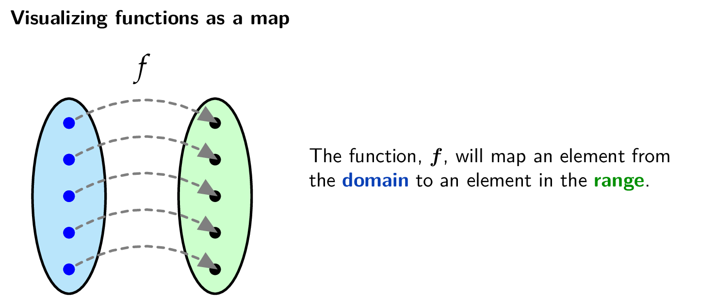
The Wikimedia diagram shown below is a standard representation of a function as a mapping between sets. It shows elements of a domain set mapped to elements of a range set, with arrows indicating the correspondence.
The revised diagram applies the same color encoding used throughout this portfolio piece: blue for the domain and its elements, green for the range and its elements. The function maps each element from the domain to exactly one element in the range. Subsequent treatments of relations versus functions, surjectivity, and bijectivity should also follow these conventions so the visual language remains consistent across examples.
Example 3 of 3
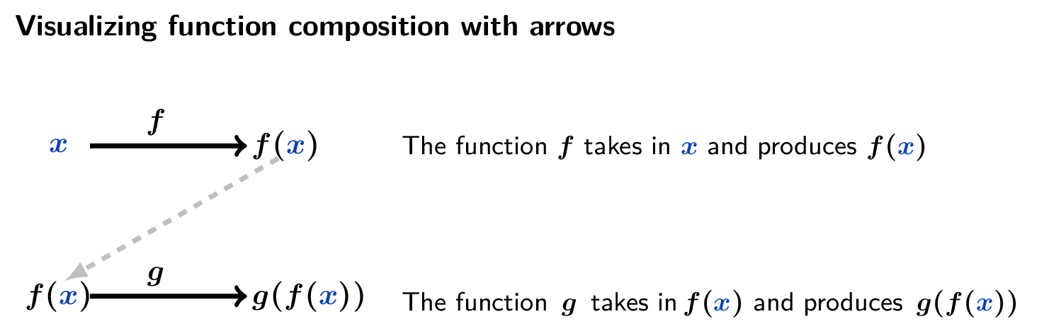
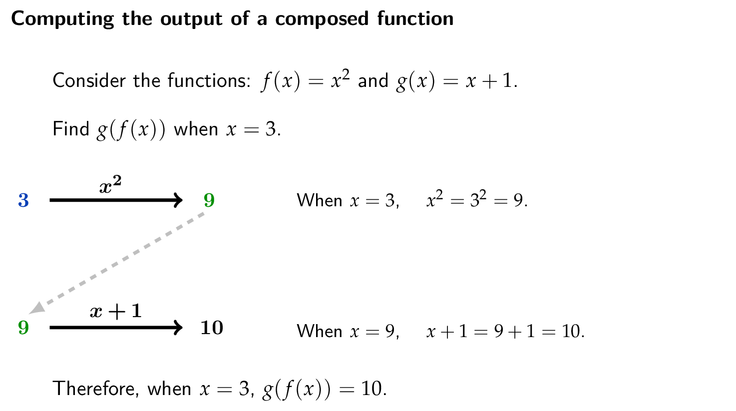
Visual Representation: Function Composition
The Wikimedia diagram shown below features machine diagrams that are labeled with the intermediate computed values to demonstrate how to compute a composed function. The machine metaphor is present but is not doing instructional work.
The revised diagram replaces the machine with a horizontal arrow notation that mirrors how mathematicians write composition. Most critically, the intermediate value must be shown as simultaneously the output of f and the input to g. This is conveyed by a dashed diagonal connector that makes the handoff visible. The diagram appears twice: once in general form with variables and once with concrete values computed step by step. This format preserves structure and reliably conveys the different levels of abstraction.
The goal of revising these diagrams is not simply to produce prettier visual assets. As a component of the visual structure does the same work as the mathematical structure. This allows a student to see the composition happening, not just read the corresponding mathematical notation.